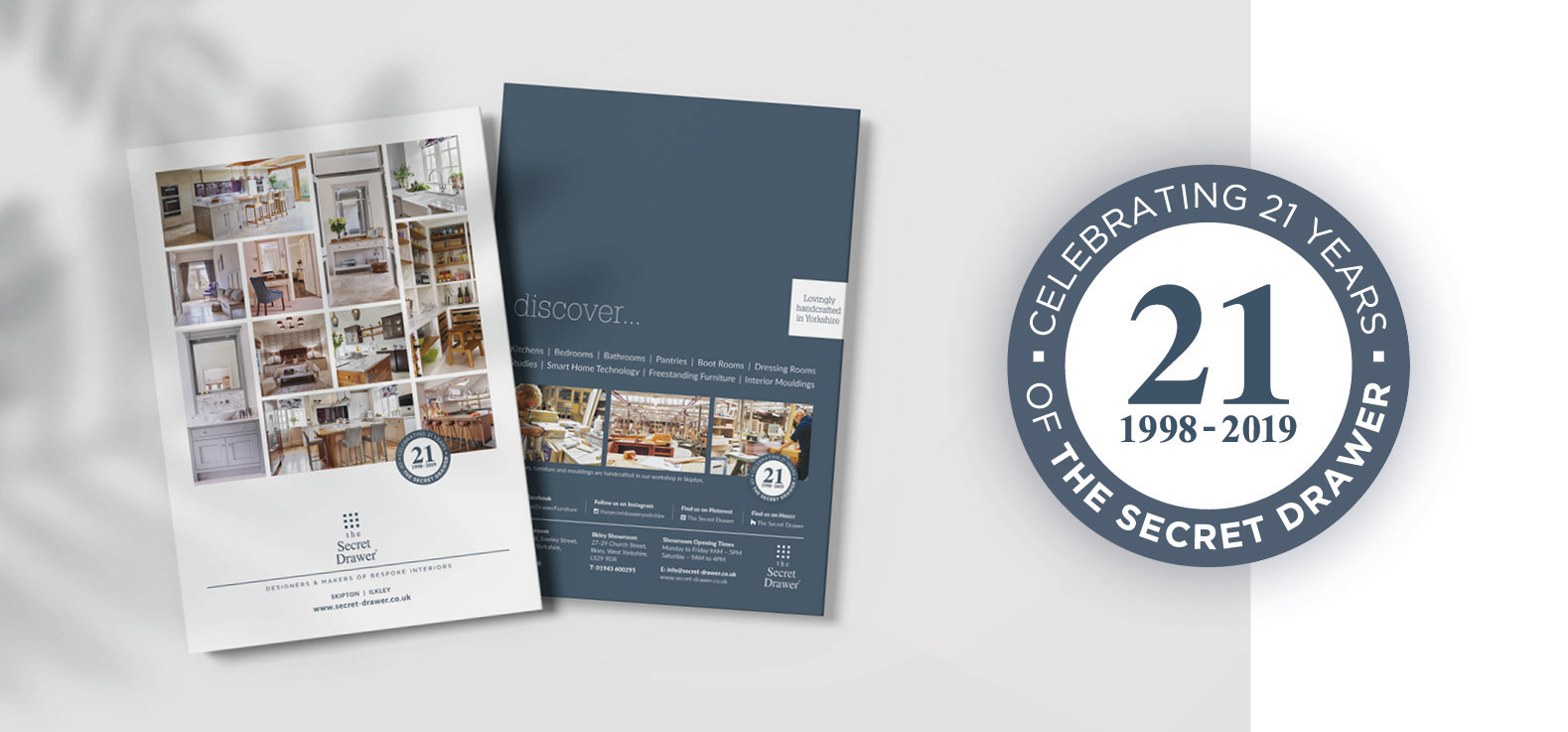
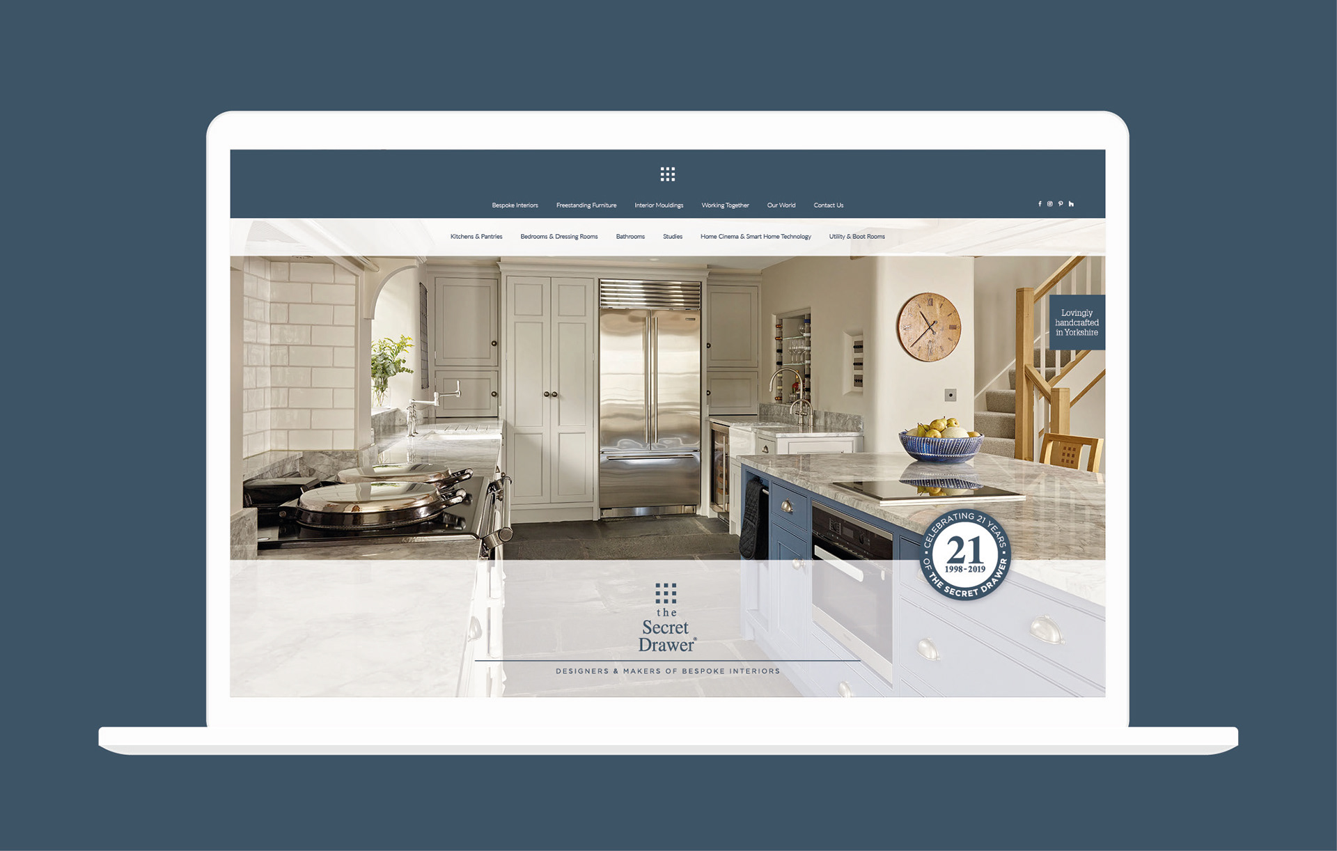
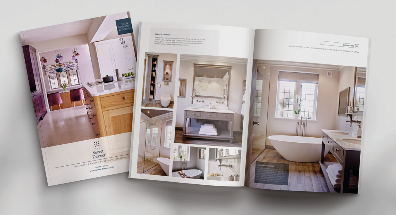
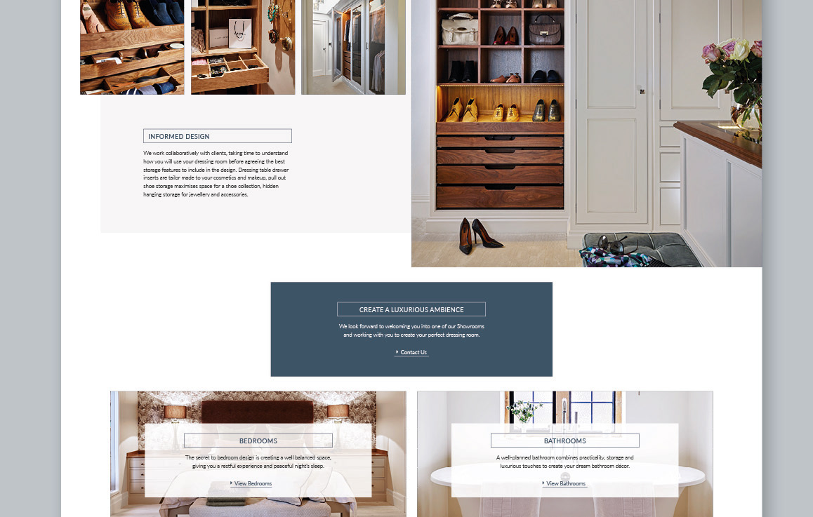
The style uses grids of images to reflect the brand logo and is easily adaptable across all products and platforms.
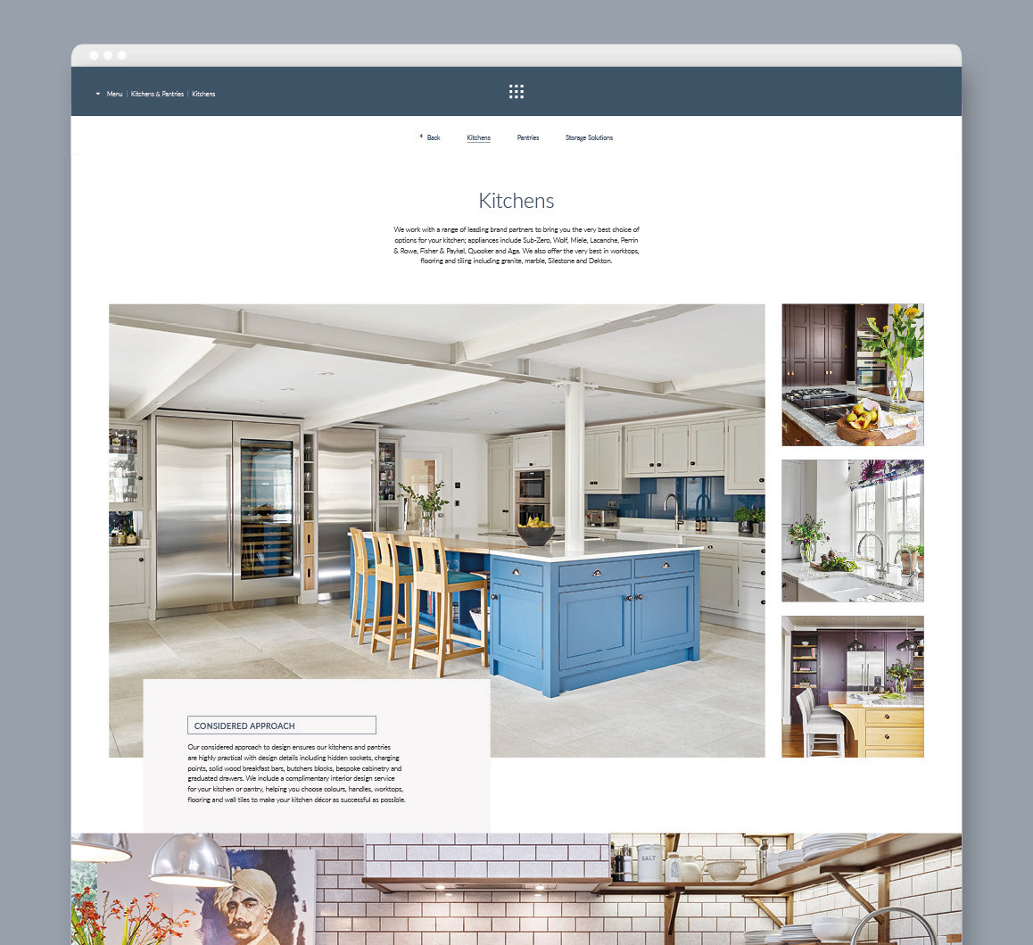
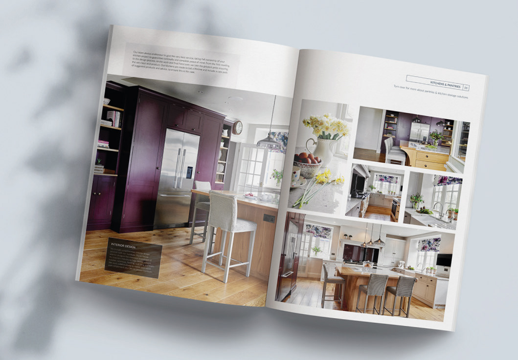
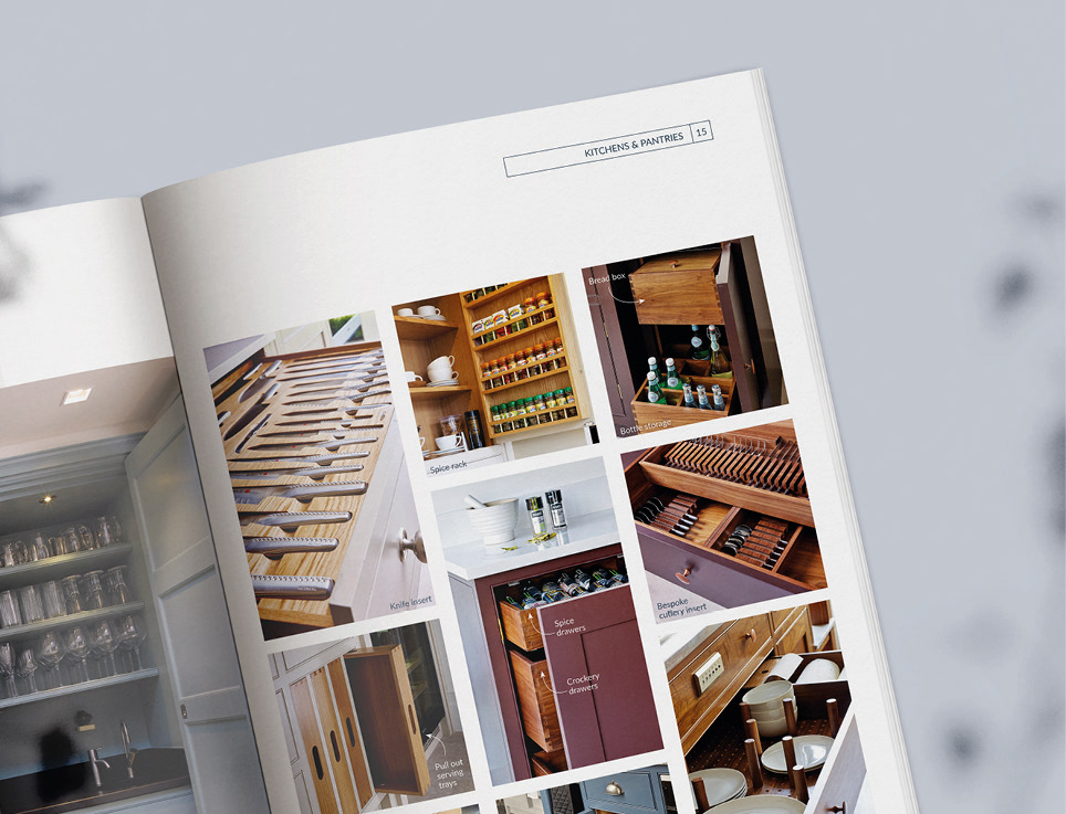
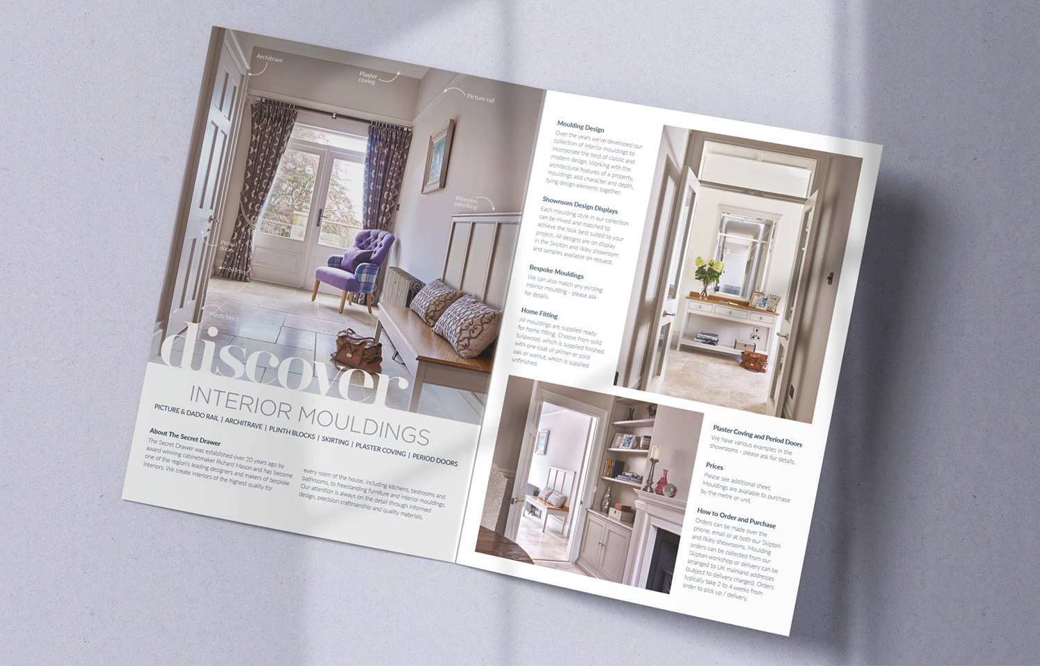
The simple grid layouts and use of big, bold images showcases their beautiful, bespoke interiors with focus on the small details.
I was also tasked with developing a logo stamp to commemorate the 21st anniversary of The Secret Drawer, and explored various different shapes and styles to complement the brand logo.
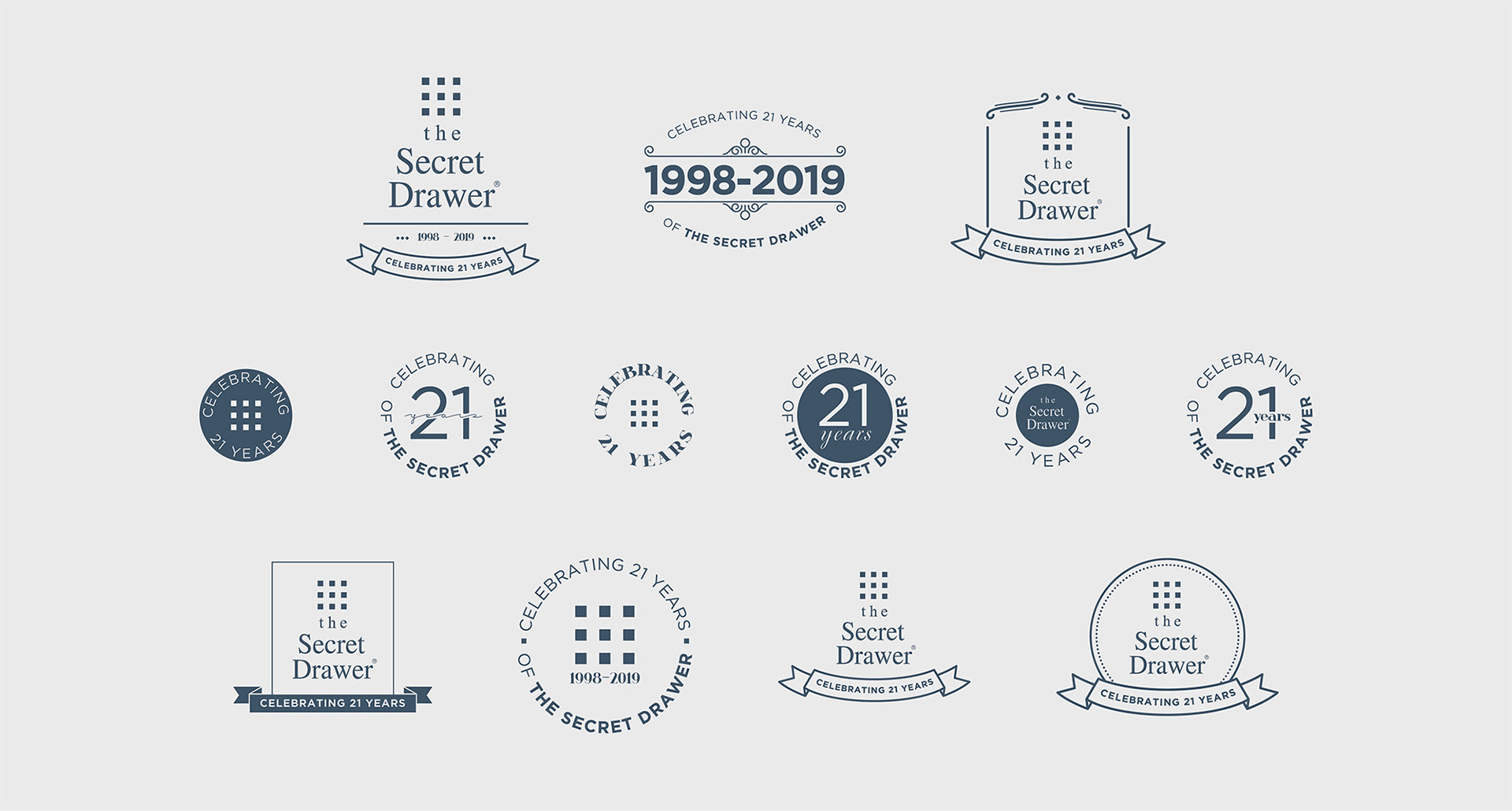
The finalised anniversary stamp was applied to various printed postcards and brochures.