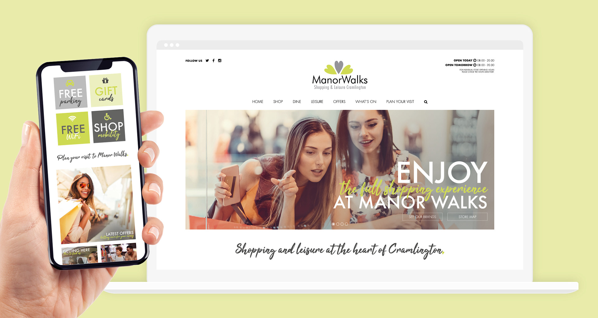

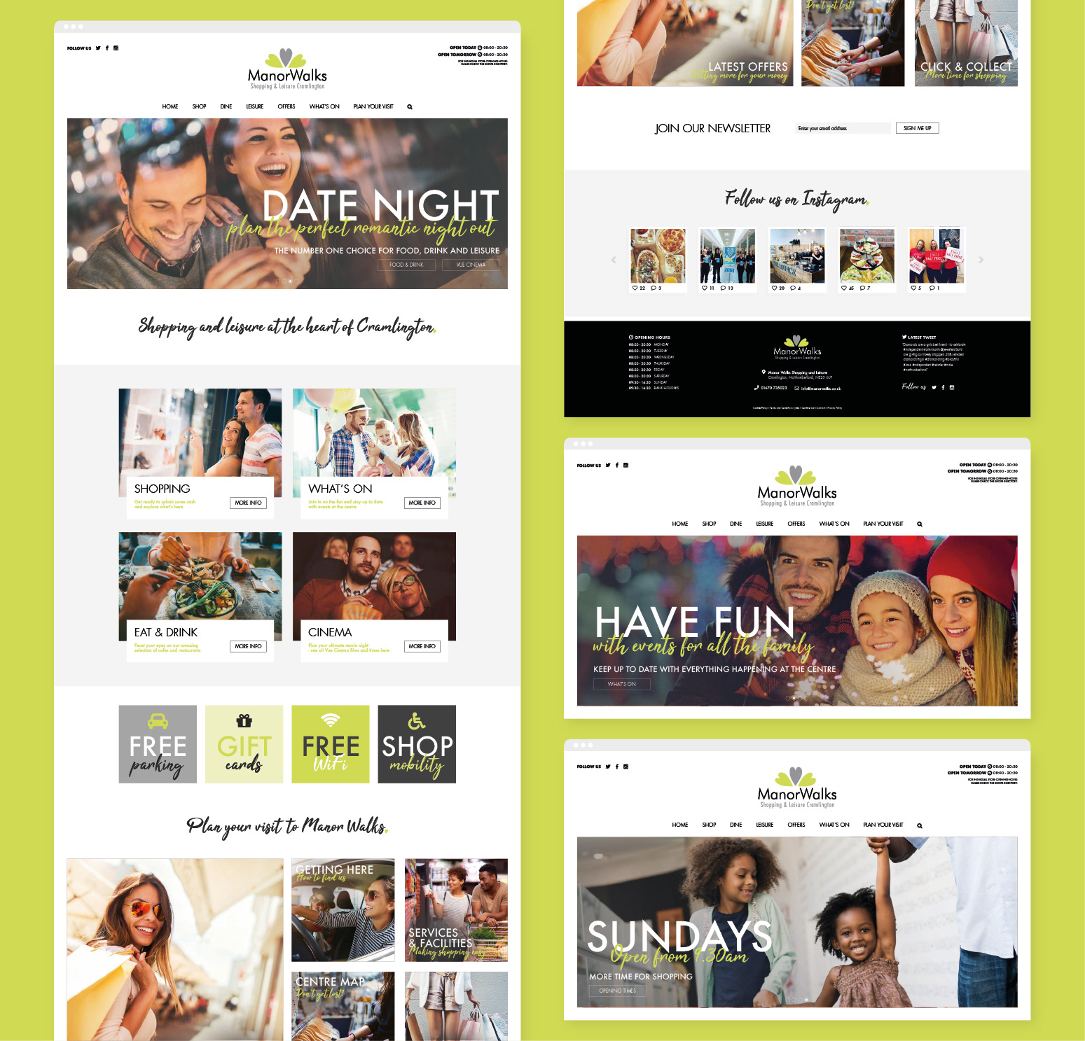
For the layout, I focused on clean, responsive grids that would easily work on desktop and mobile views, while allowing for large amounts of breathing space to break up the content.
The design features tints of the main brand colours to add a fresh and vibrant feel, combined with carefully curated stock imagery, hand-drawn typography and icons to bring life to the shopping centre offering.
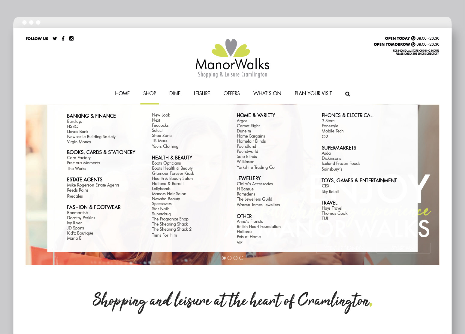
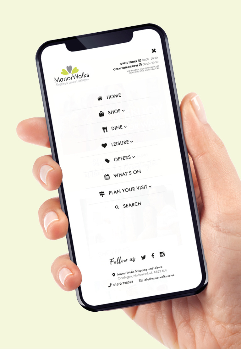
The website would be navigated through a simple mega menu to easily display the large offering the centre provides. This menu also translates into the mobile design, featuring icons to help with quick navigation.