The previous branding was outdated, confused and inconsistent between the various elements of the charity.
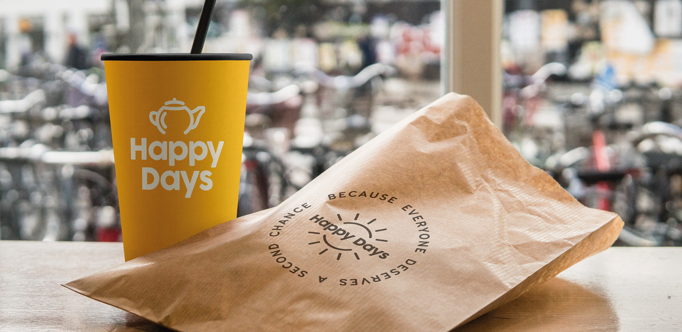
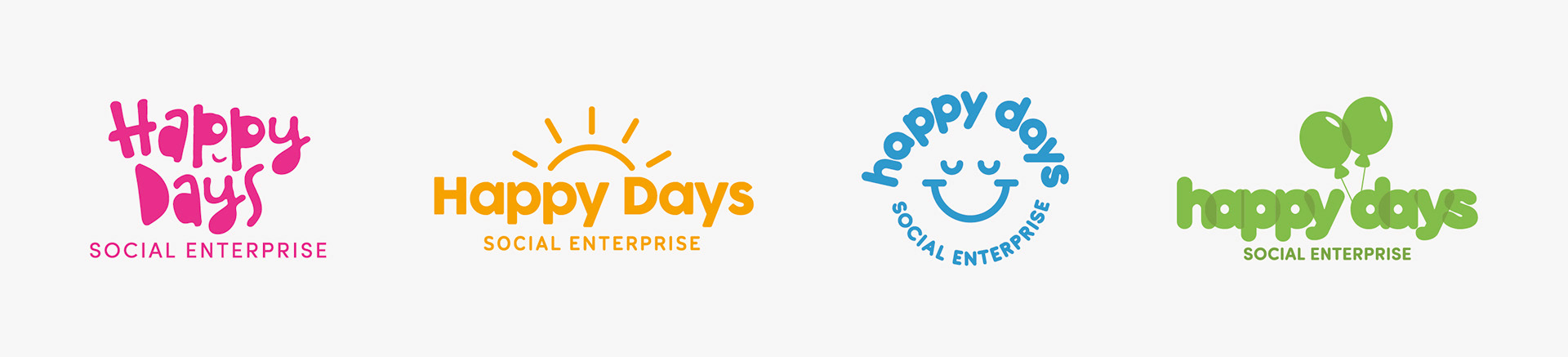
After exploring various visualisations of the theme 'happy', I developed the sunshine route.
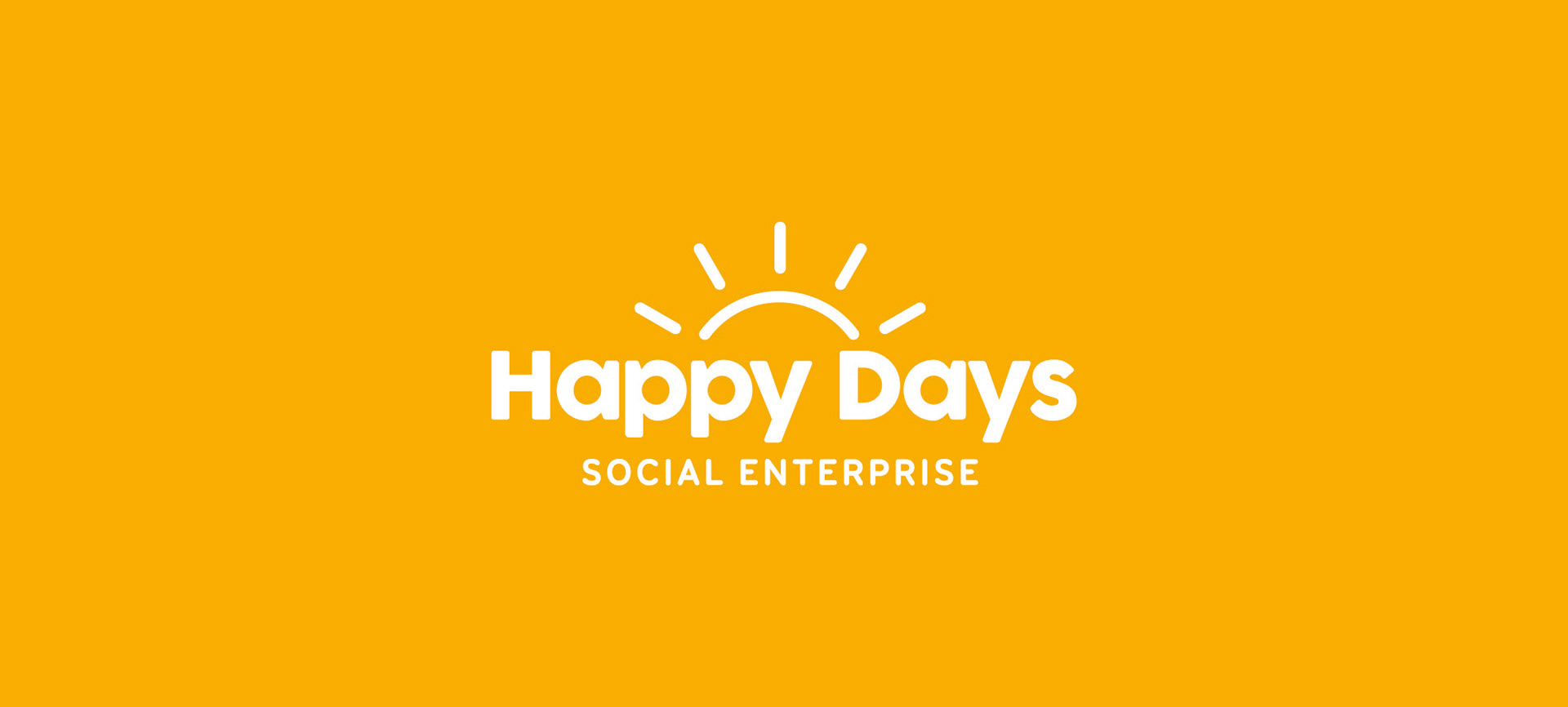
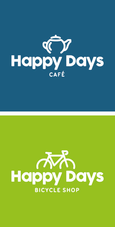
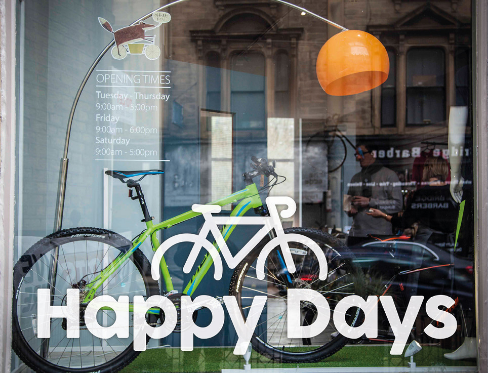
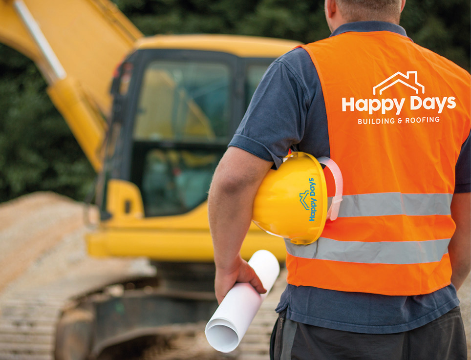
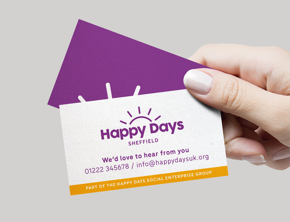
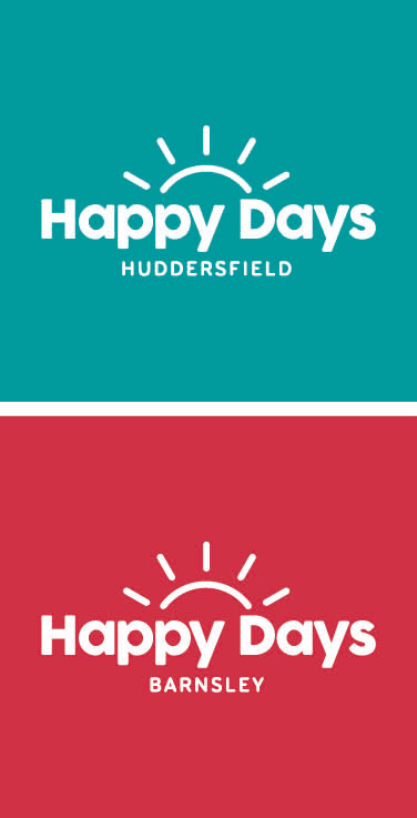
The chosen route was bold and flexible, ready to be applied to the different sub-brands and with scope to expand the brands further in the future.

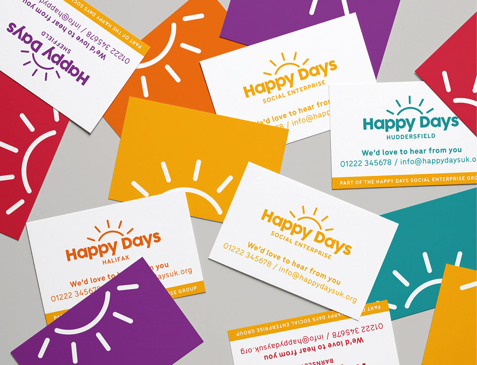
This new rebrand featured a vibrant colour scheme, with a playful type treatment and friendly sub-brand logo graphics which all fit under the main umbrella brand.
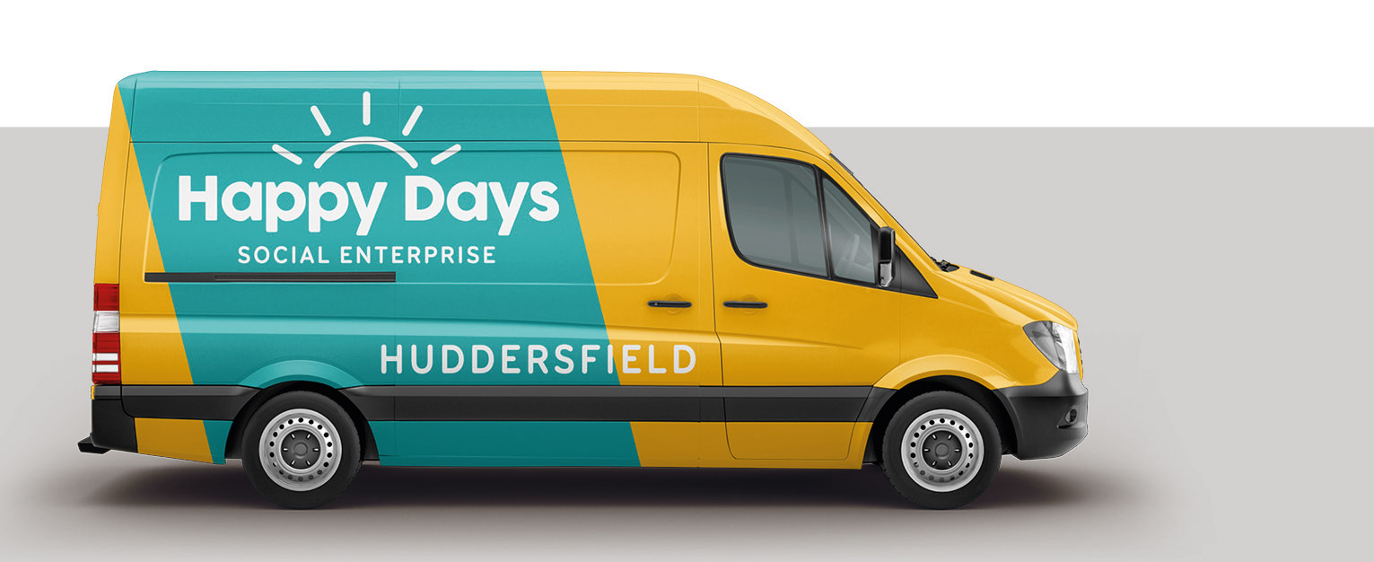
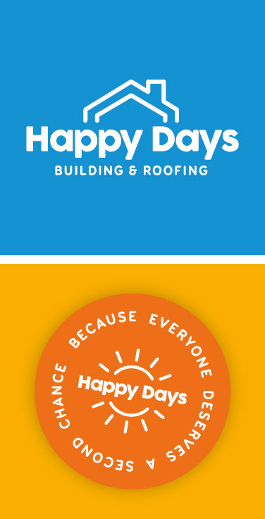
The Happy Days sub-brands include a building & roofing company, a café and a bicycle shop.