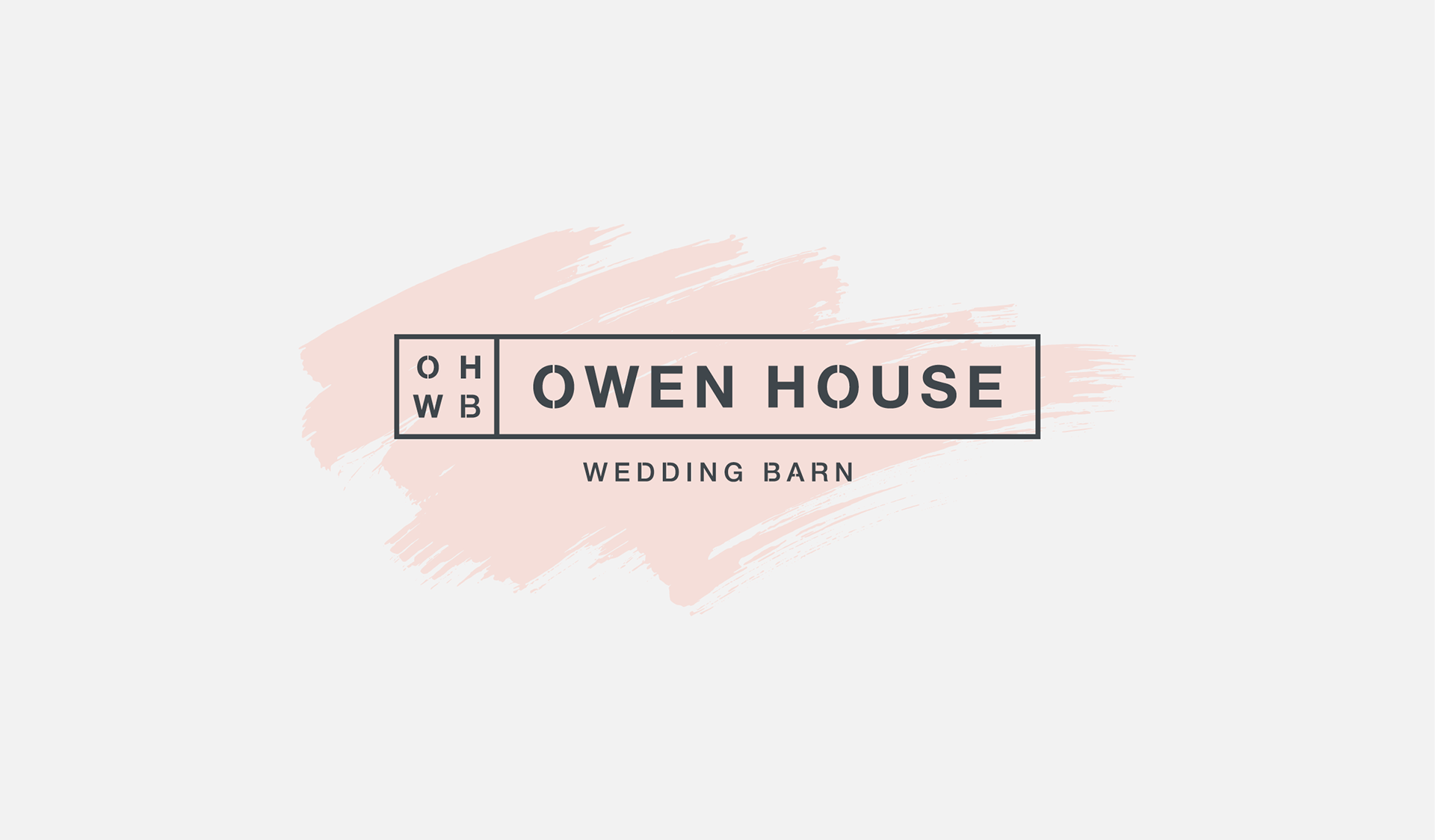

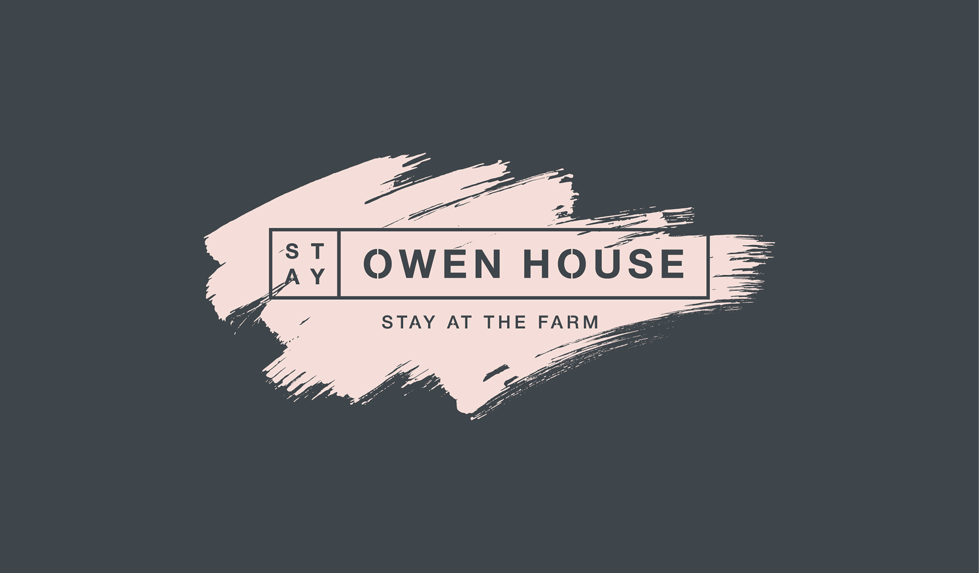
The branding for Owen House took inspiration from stencil signage already in existence around the farm. The owners wanted to carry through the rustic styling of this signage and the decor of the farm buildings, and match that with a romantic softness that represented the wedding business.
Stencil signage inspired logo exploration
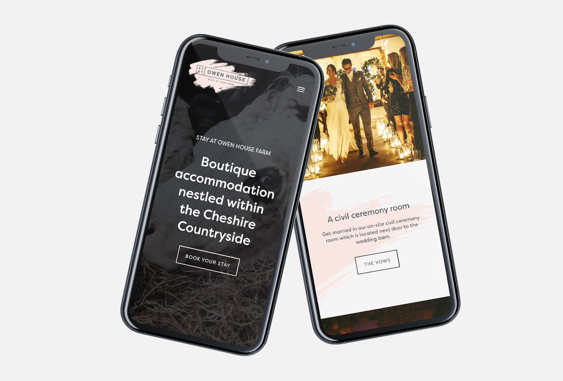
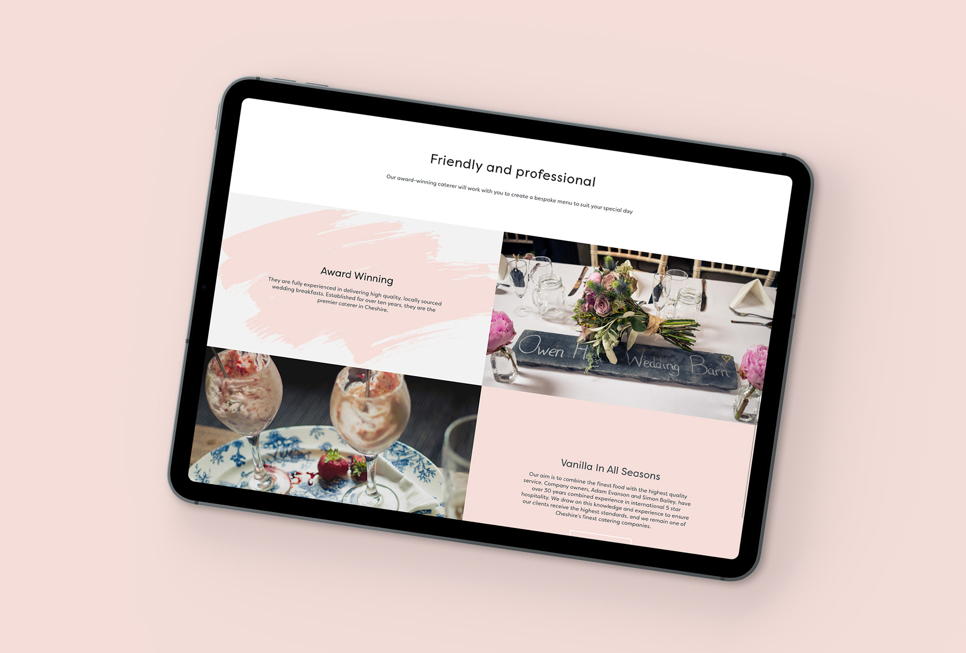
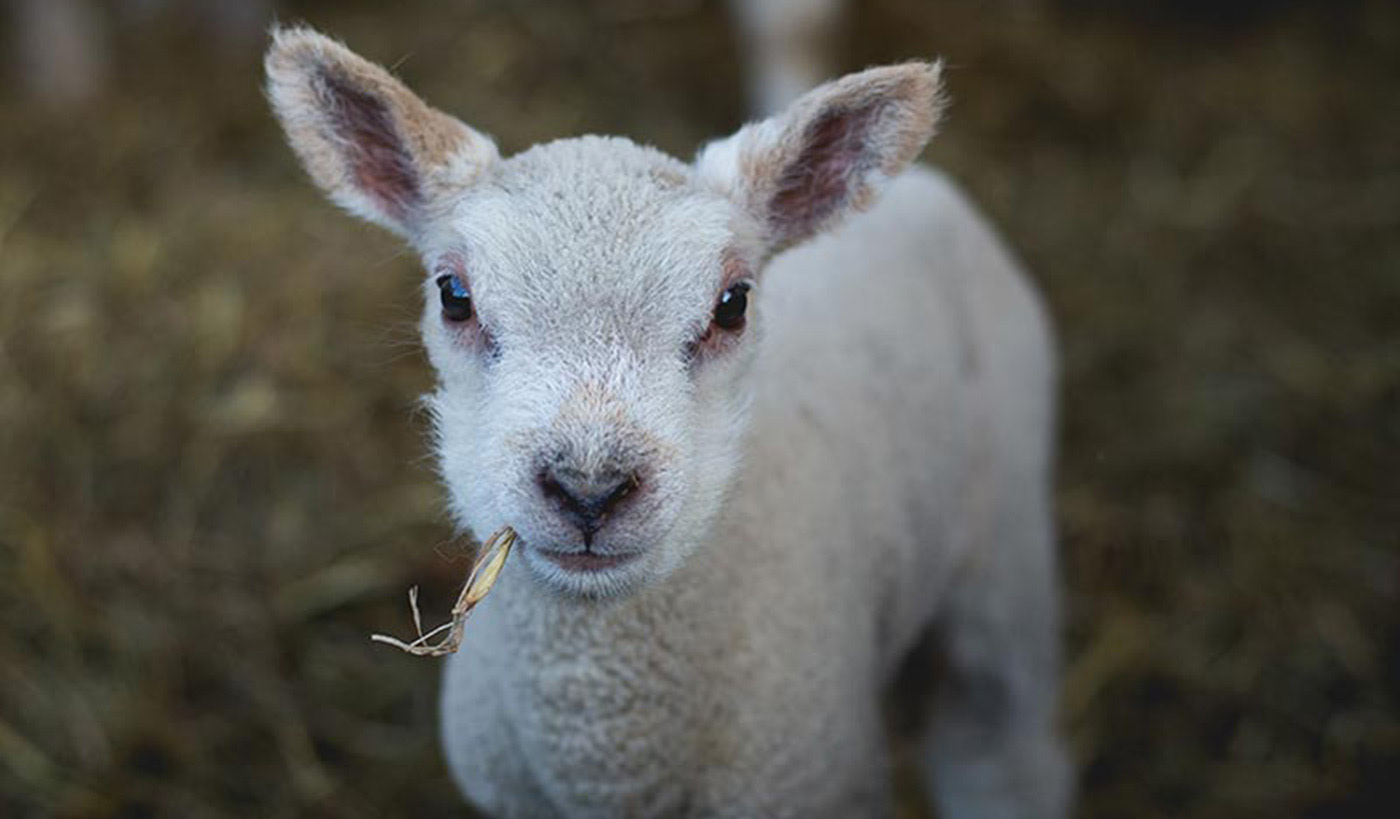
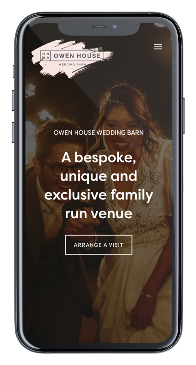
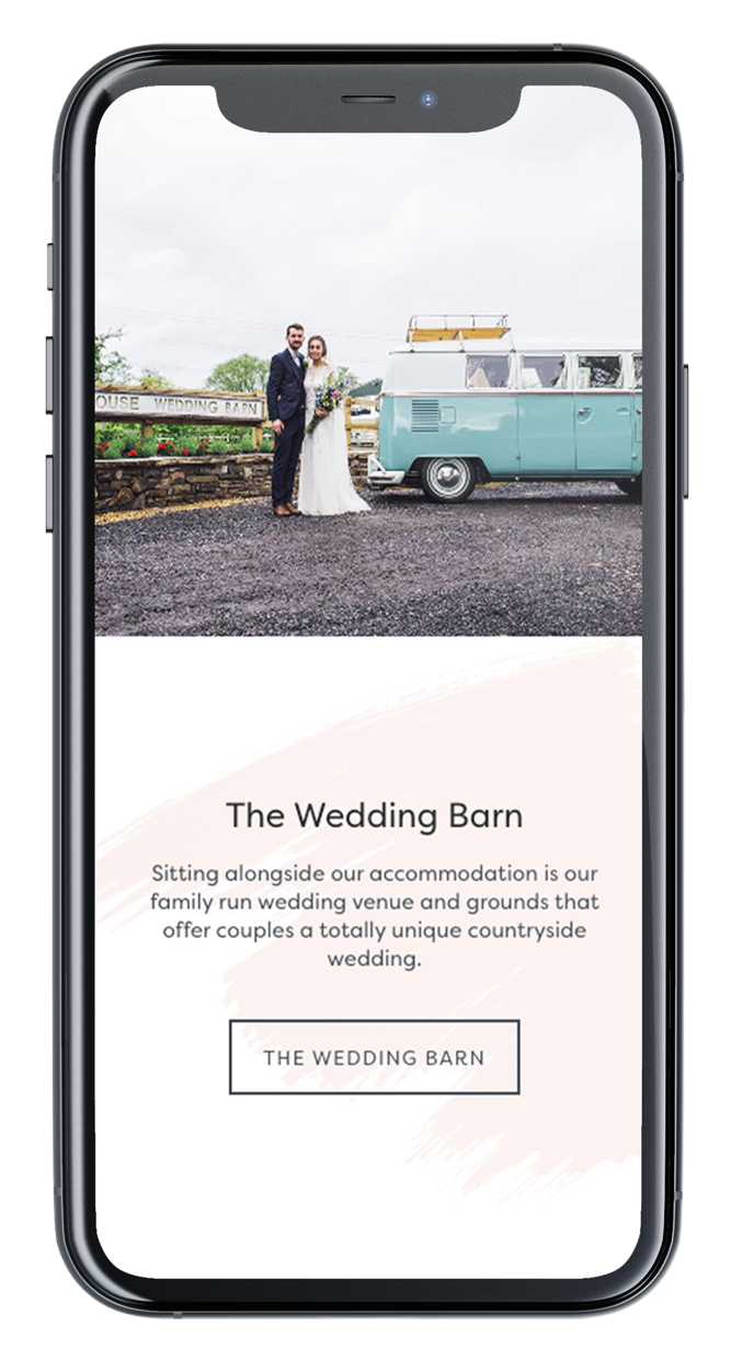
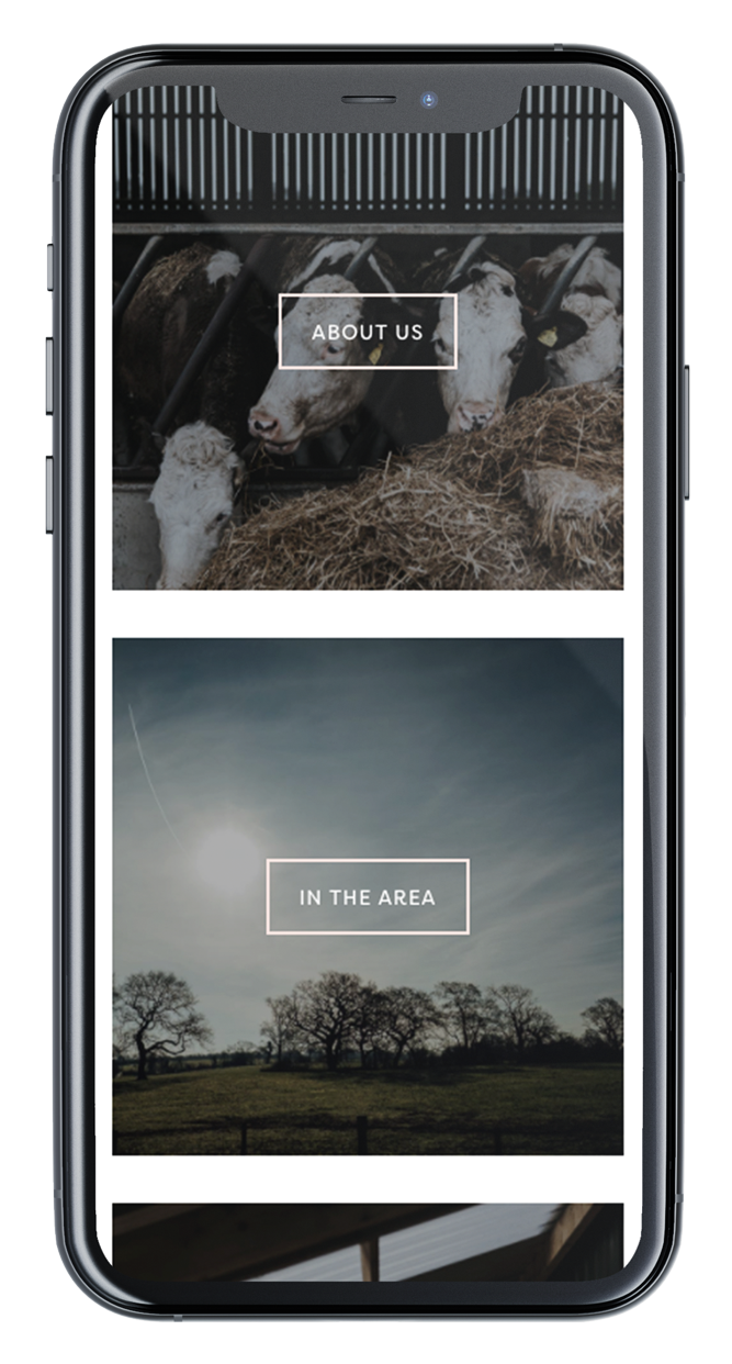
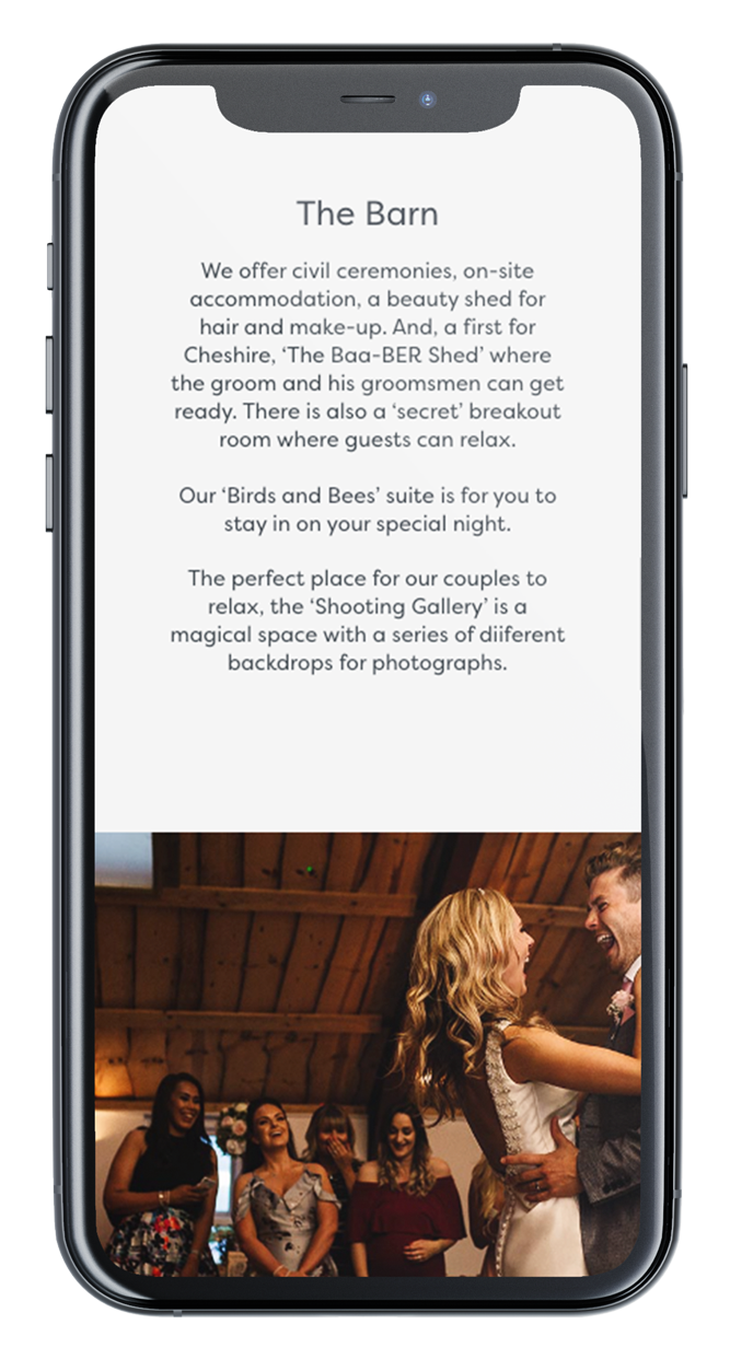
The two websites both featured simple layouts with a clear user journey, utilising the incredible imagery of the location, farm animals and from some of the many weddings held there.
The softness of the paint swash within the branding was brought into the website to contrast against the bold images and simple layouts. Subtle details, such as the rectangular buttons, also tied into the stencil signage inspired branding.
All images supplied by Owen House Wedding Barn.
